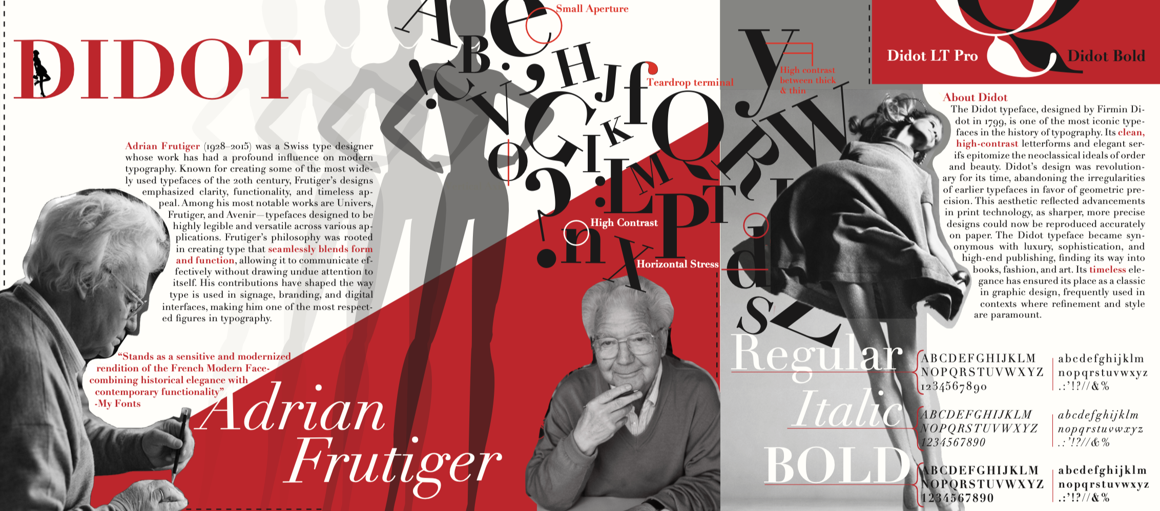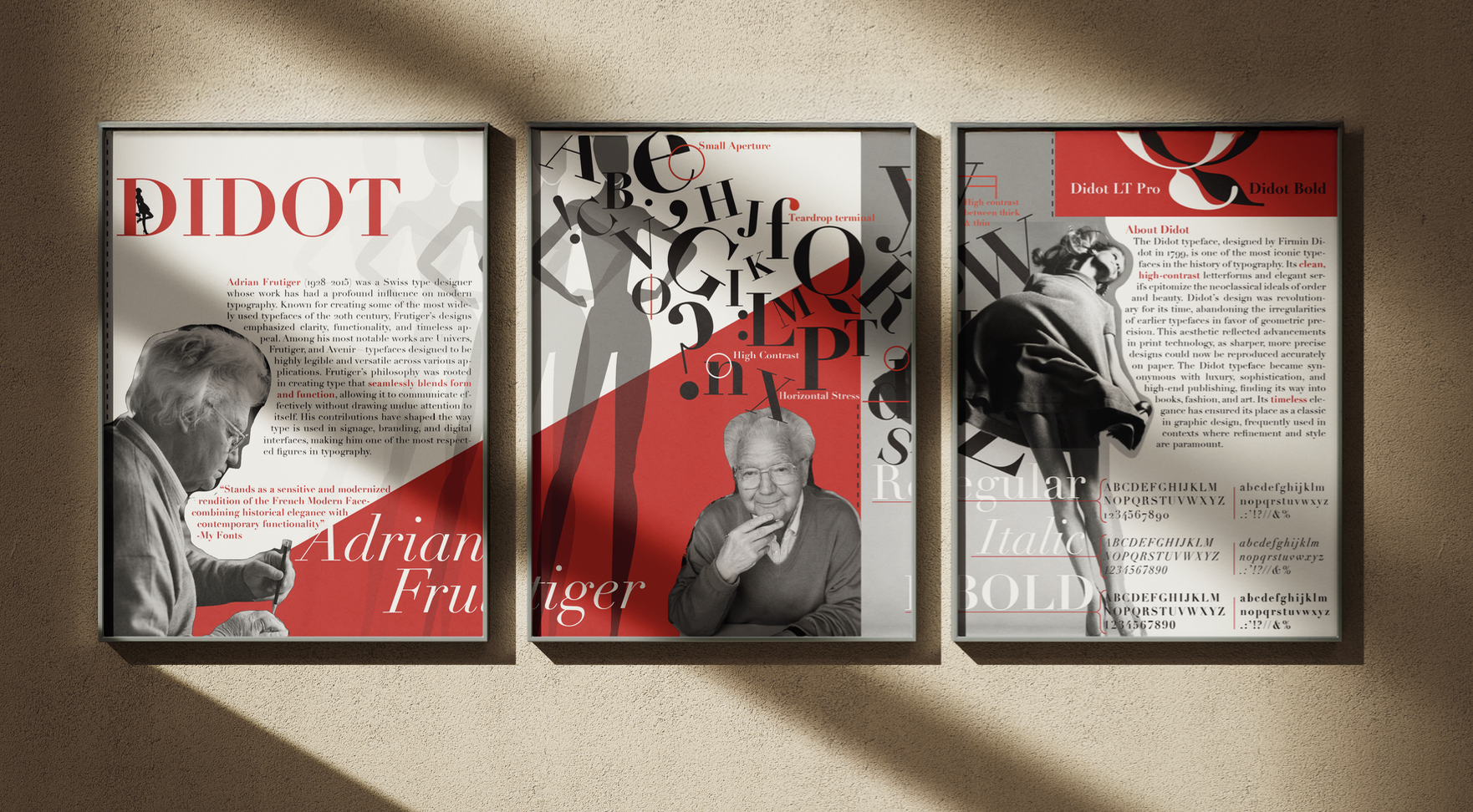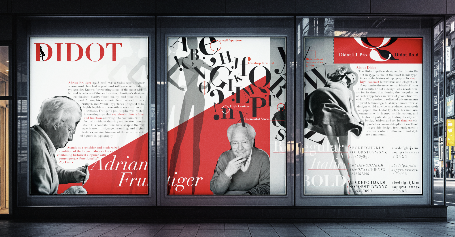
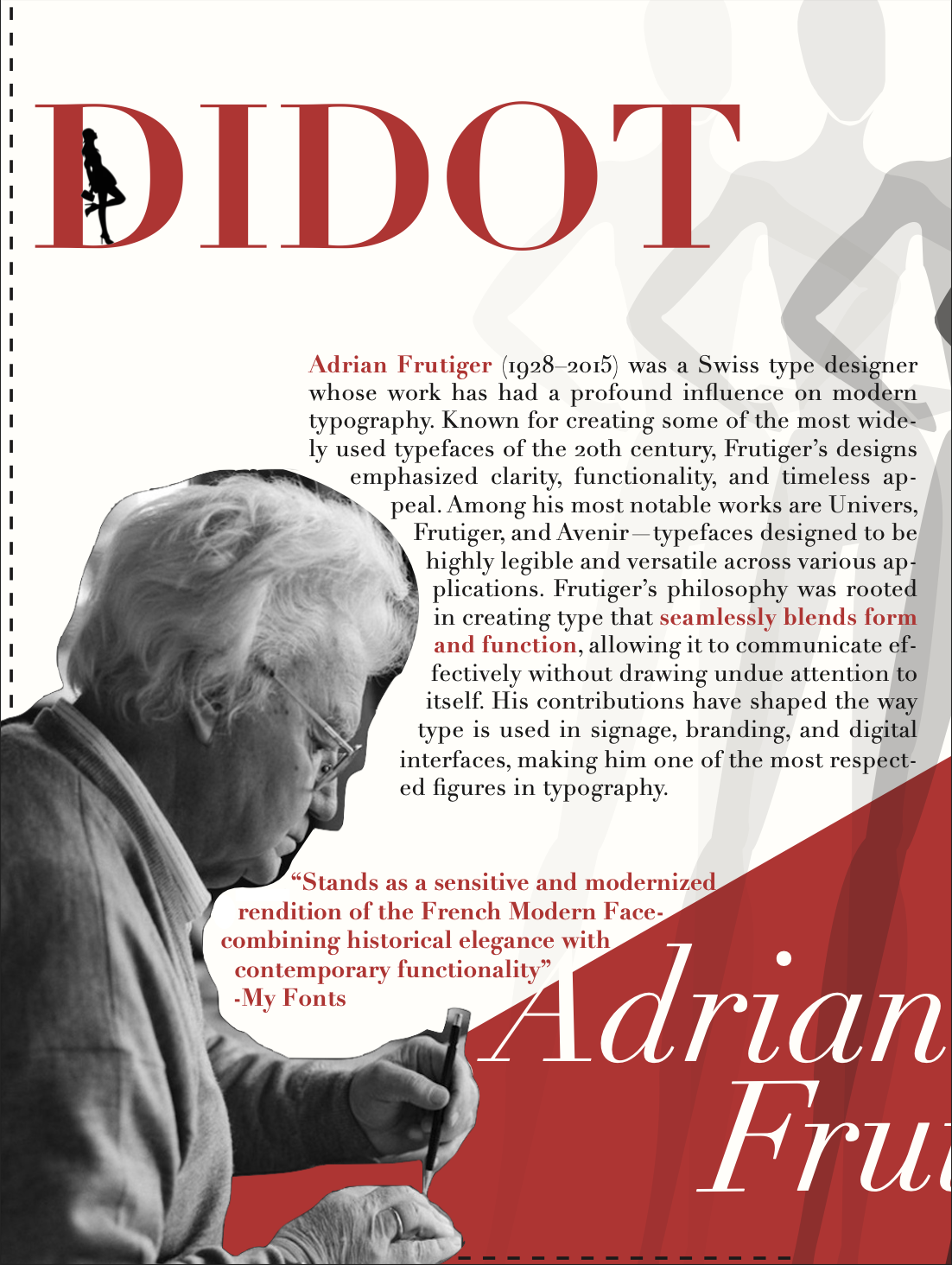
Didot Type Study
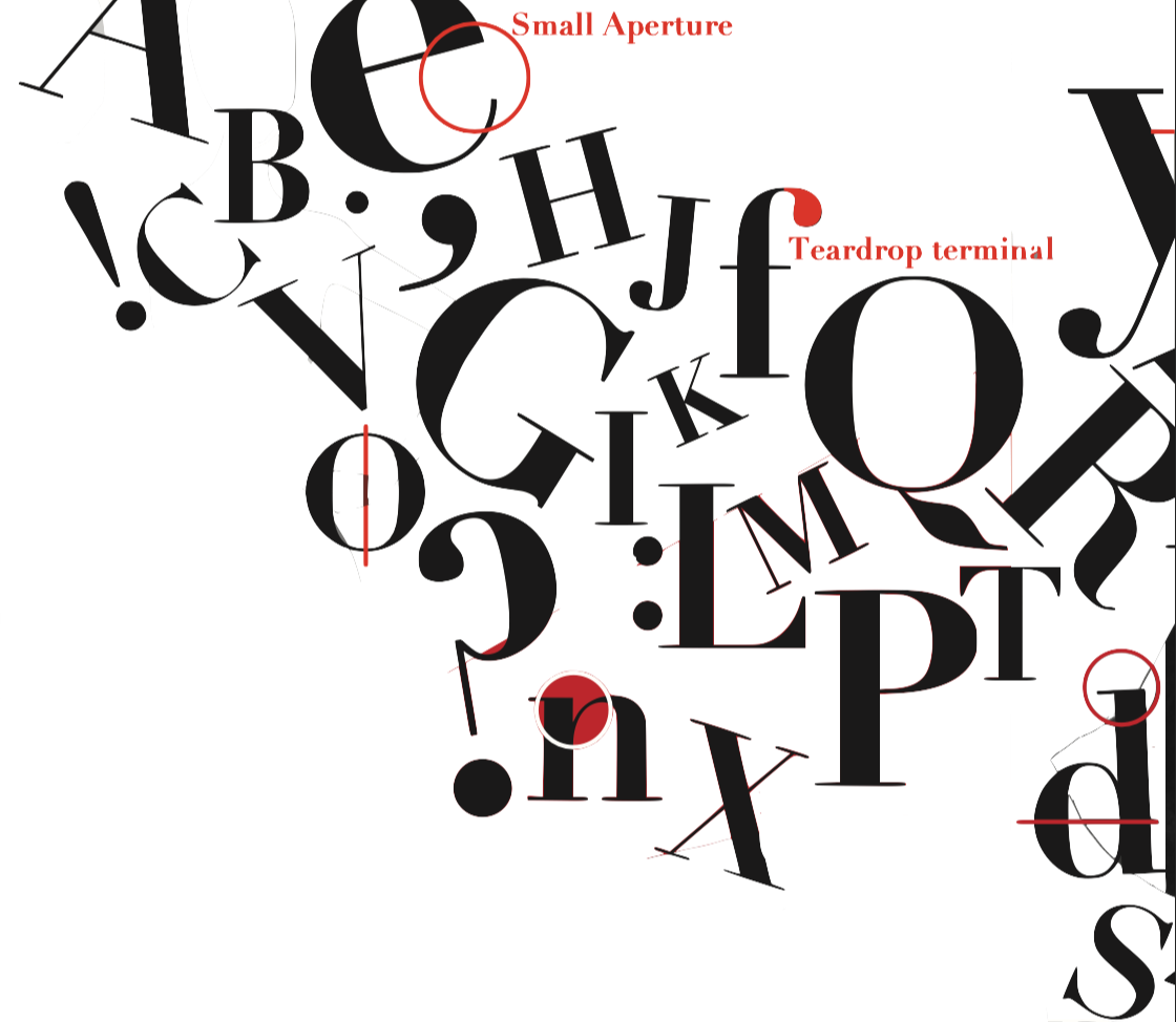
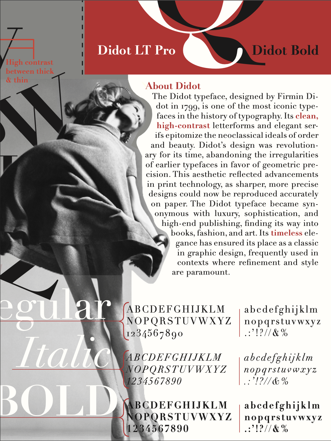
For this project, I researched the Didot type family, studying its history, key features, and visual impact. I focused on its high contrast strokes, vertical axis, and teardrop terminals, and how it reflects neoclassical elegance in modern design.
C = 15 M = 100
Y = 100 K = 0
C = 100 M = 0
Y = 0 K = 100
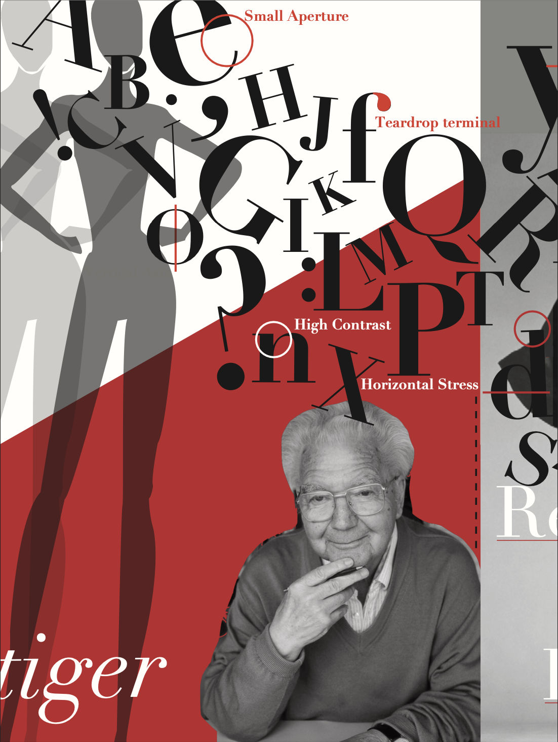
This composition explores key features of the Didot typeface through layered and rotated letterforms. Red annotations highlight details such as high contrast strokes, vertical stress, small apertures, and teardrop terminals.